
Redefining and Elevating
The Property Details Page
Project Type:
Experience uplift of key / most used page across desktop responsive mobile and the app
Industry:
Start up - PropTech / Realestate
Team Members:
Product Manager
CEO
CTO
12 Engineers (Frontend, backend, mobile devs)
My Role:
Product Designer
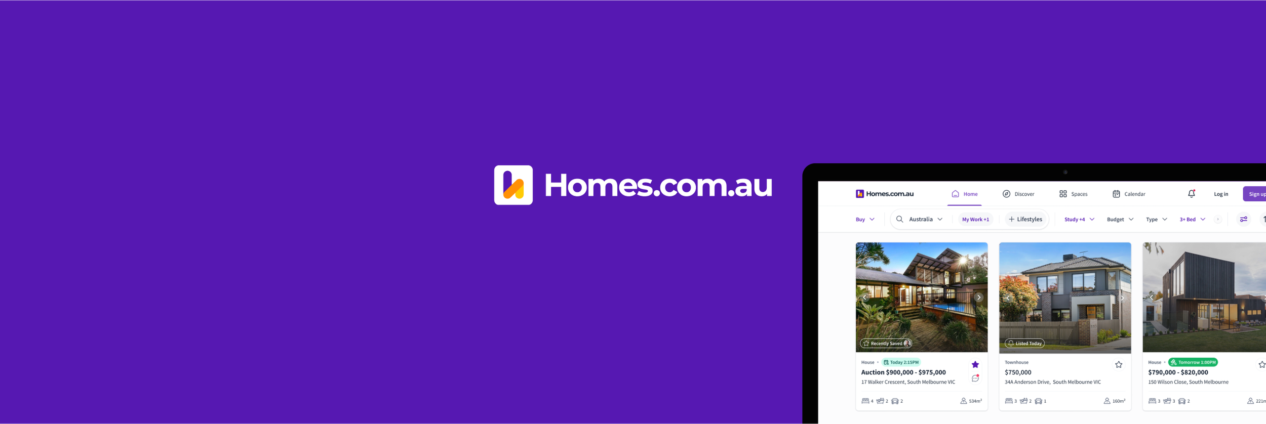
About homes.com.au
Homes.com.au is a online real estate marketplace in Australia, dedicated to empowering consumers with data, inspiration, and search and collaboration tools.
The target user is consumers first unlike the other portals which focuses and make money from agents. Hence the slogan, helping everyday Australians find their next home faster!
Homes has been around for 6 years but has had 2 re-boots. The latest reboot was around 3 years ago. I joined them in Oct. 2022.

About this initiative / project.
Both the CEO and the Product Manager (PM) wanted to uplifting the existing page. While I agreed that the page required enhancements, I advocated for a broader vision. It wasn’t just about uplifting the UI which is what they were pushing for. I believed it was essential to elevate the entire user experience with clearly defined goals and if we had any insights from our user data we should look at it.
it was important that I review the exisiting experience of the property details page as I was built prior to me joining the company.
The Approach
Review the exisiting experience
Review any data we have on the existing experience
Competitor Analysis
User Interviews x4
UX Lean Canvas with CEO, PM, CTO, Engineering Lead


The Key Findings.

The User Goal In A Single Sentence
Swiftly collect all essential information about a property, such as its condition, layout, features, and nearby amenities, to assess whether it merits a physical inspection.
Information Hierarchy

A quick attempt at information hierarchy to try and capture what new information could be added to the new listing page.
Somethings were added here as the CEO and PM were pushing for it. e.g. Suburb trends, listing engagement even though there wasn’t strong evidence to support that is what users want.
My Design Goals (I set these for my self)

Desktop Wireframes
Different Alternatives considered

The Mobile App Wireframes

Final Outcome after Internal Usability Testing
For Desktop the outcome was to proceed with option A. The 2 panel version didnt perform that well, it felt like the space on the big screen was not well used since the content was cramped into 1/3 the screen.
For Mobile. Option A is actually going to be the responsive mobile version. Option B is going to be the Mobile App version, so I’ve come good on “leveraging the power of react native” :)
Interactions
Desktop Video and Mobile App Video.
Final UI in preparation for handover
This is currently in development.

Other case studies from my time at Homes.com.au coming soon.

Mobile App IA Re-Think - Case Study Coming Soon

A More Powerful Search - Case Study Coming Soon

Collaboration in Spaces - Case Study Coming Soon

Social Logins / Sign Ups - Case Study Coming Soon